


Getting Paasa from 0 to 1
How we've approached building quickly and iteratively

This post is a bit different from our typical financial ones. We decided to share how we make decisions about building Paasa’s product as it is today.
Building a product platform from scratch is like raising a baby. You start with the basics: choosing the right font, color palette, tone, logo, and other details that define the product's personality. These decisions shape the brand's future.
Then, there’s the challenge of roadmapping features. Poor prioritization can lead to users giving feedback on unnecessary features or limit flexibility in execution. In my previous product roles at SoFi and UIPath, I had weeks to discuss and navigate internal processes to get approvals, but time is of the essence at a startup. We run a lean format for user feedback, quickly implement changes, and trust our instincts.
Thirdly, a high standard for quality and trustworthiness is non-negotiable for a fintech app. We must ensure that users feel confident and secure using our platform to manage their money. Our goal was to align the product with our long-term vision while remaining flexible enough to adjust based on new user insights
I established design principles suited for a startup to guide us through this phase.
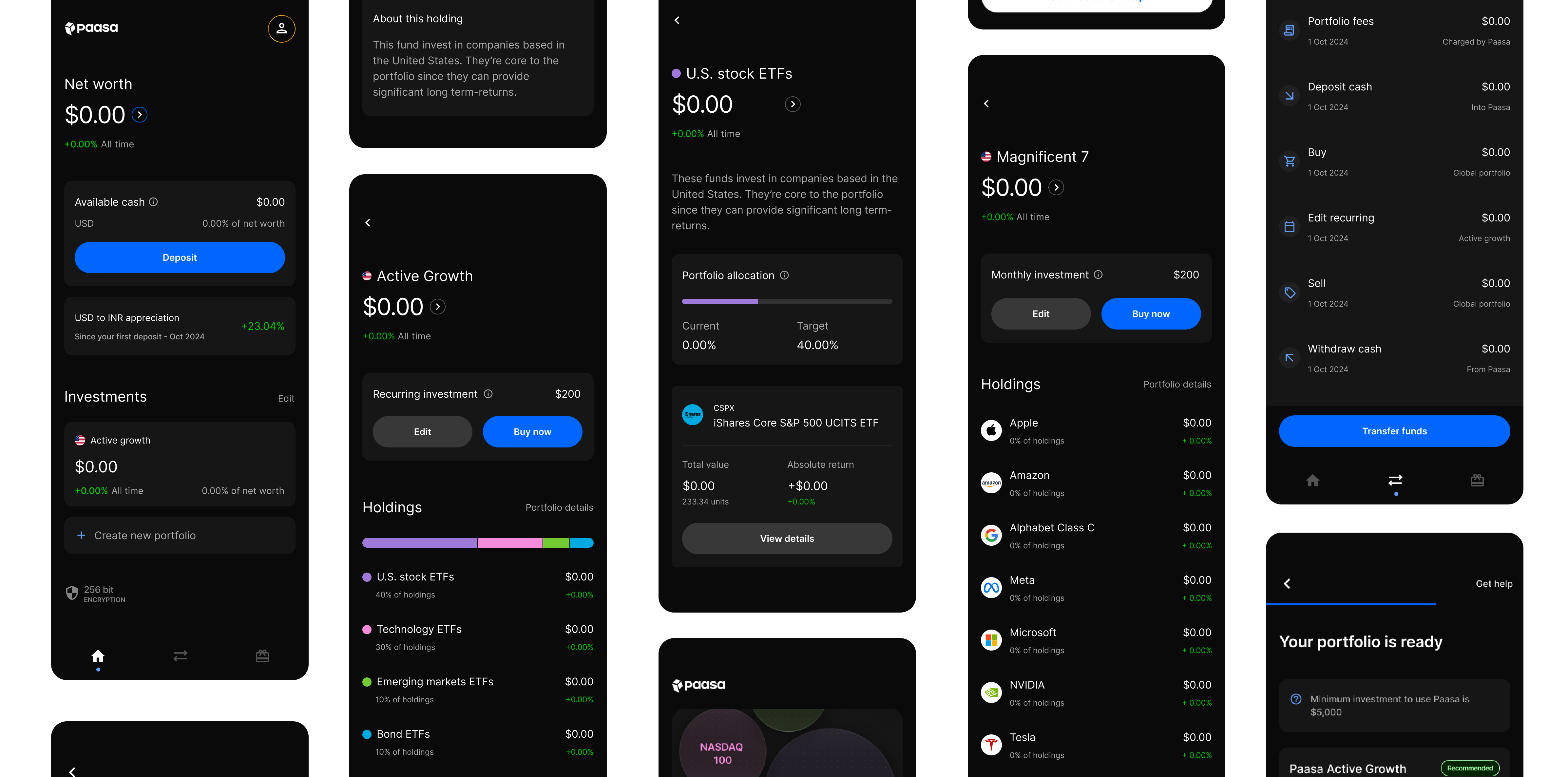
1. Compromise on aesthetics when necessary, but never on clarity. As a designer, any screen or feature can be presented aesthetically pleasing and functional, but this takes time - usually many iterations. For our MVP, we focused on presenting the most critical data clearly, even if the visuals weren’t as refined as they could be. This allowed users to focus on the core value-adds when giving feedback. Plus, it enabled us to validate our direction quickly without over-investing in features that might not work. This has made it easier to pivot our hypothesis based on user feedback.

2. Postpone design decisions when possible to make more informed choices later.
One example of this was the color selection for our app. In fintech, colors often carry significant meaning in the customer’s mind (e.g., indicating profit vs. loss). We decided to start with a minimalist black-and-white design, only introducing color when necessary to convey meaning. As new use cases emerged, we gained better insight into how color should be used. This approach allowed us to experiment with color thoughtfully, ensuring the interface evolved with user needs.

3. Avoid jargon. I’ve always disliked reading financial apps or documents filled with jargon. While the concepts weren’t complicated, the language often confused them unnecessarily. With our app, we aim to keep everything simple and accessible. When technical terms are unavoidable, we use info icons to provide clear definitions, ensuring users understand what they’re looking at.
4. Design around the user’s mental model. Many fintech apps structure their information architecture (IA) to prioritize cross-selling products. For example, they might highlight an “Explore” page while burying your account details in a deeper layer. At Paasa, we designed the IA based on how users typically expect to navigate a financial app. We display key information - like net worth and portfolios - front and center, while any upsell opportunities take a backseat.
Starting from scratch, we understood that our MVP wouldn’t be as comprehensive as other financial apps. These guiding principles have helped us stay focused, evaluate the quality of our platform, and define the core values we wanted our product to embody. I expect these principles to evolve with our business but for now, they’ve served as well while building from 0 to 1.